M&M Food
Market
Time period: 2019-2020
Role: UI Design
Agency: Bounteous
M&M Food Market is a Canadian frozen food retail franchise. Started in 1980, the original business model was to provide good quality meat at lower prices. Today, they offer a selection beyond frozen meats to include sushi, fish tacos, frozen produce, and other healthier selections.
M&M was looking to both re-platform and redesign their website. Their primary goal was to translate their new in-store look to their ecommerce experience.
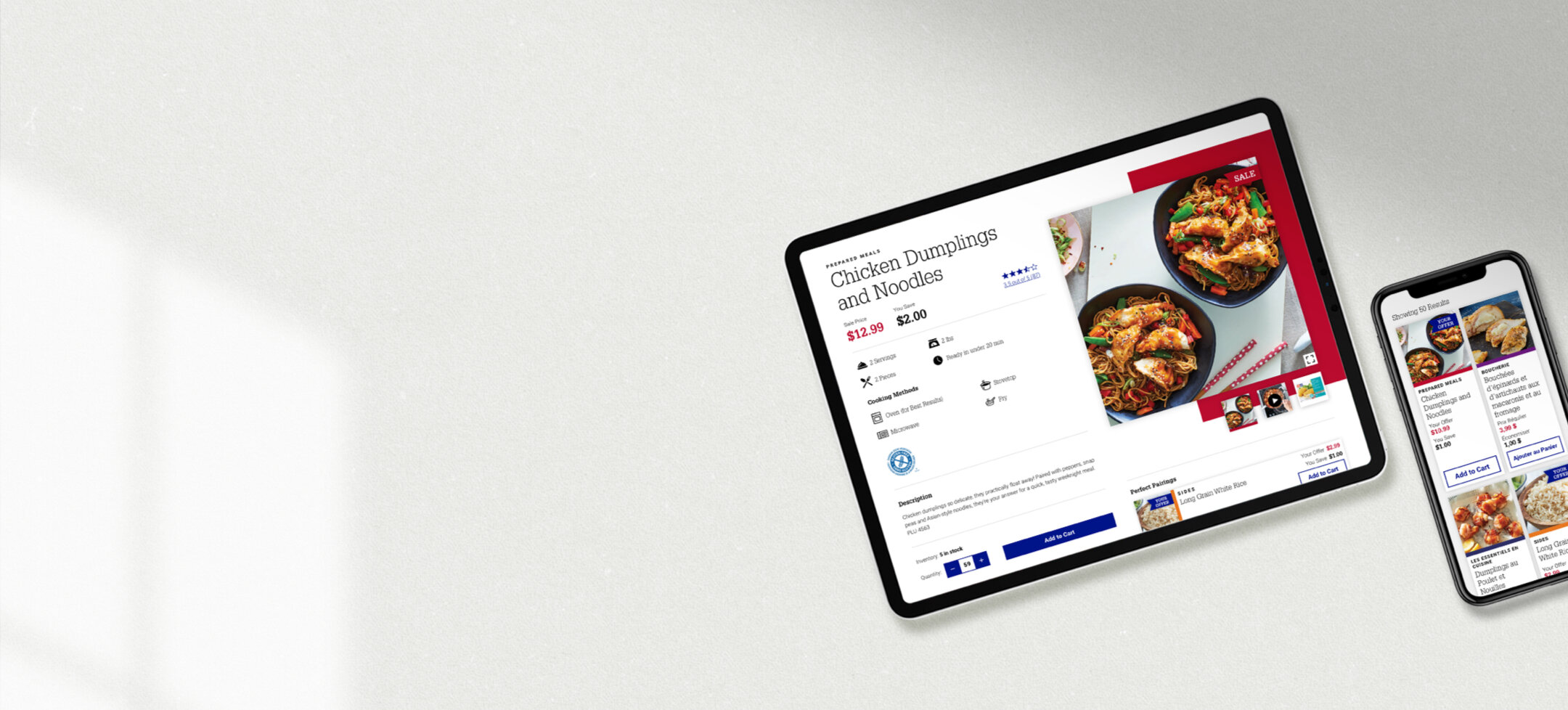
Prior to partnering with Bounteous, M&M had recently completed a redesign of their packaging and in-store shopping experience. A key component of the new look was color coding for each of their 13 product categories which range from red for Prepared Meals to grey for Soups / Sauces. One of the biggest challenges for this project was to mirror the enhanced wayfinding the category colors bring to the in-store shopping experience, while also making the web experience accessible – which is especially important for a Canadian brand that must adhere to stricter accessibility regulations.
Another big consideration for M&M’s site was the need for all components to work in both English and French. If you’re unfamiliar, French can have much longer words that can make it tricky when designing things like product cards or buttons, especially on mobile.
M&M had a desire for more than one product to be seen at a time on mobile because of their vast product line and to limit the amount of scrolling the user would need to do. After much trial and error, I was able to design a product card solution that took into account the clients wants, that worked in both English and French, and expressed each category color cleanly and clearly.
Examples of previous card explorations.


