AFS Website + Brand Refresh
Time period: 2016-2017
Client: Artists Frame Service
Role: Art Direction, UI Design, Graphic Design
Collaborators: Jamie Eggert (Brand Consultant)
As the In-House Designer at Artists Frame Service, I had the opportunity to refresh the branding for this 40-year old titan of the framing industry in conjunction to creating a new site design.
01 –
Brand Refresh
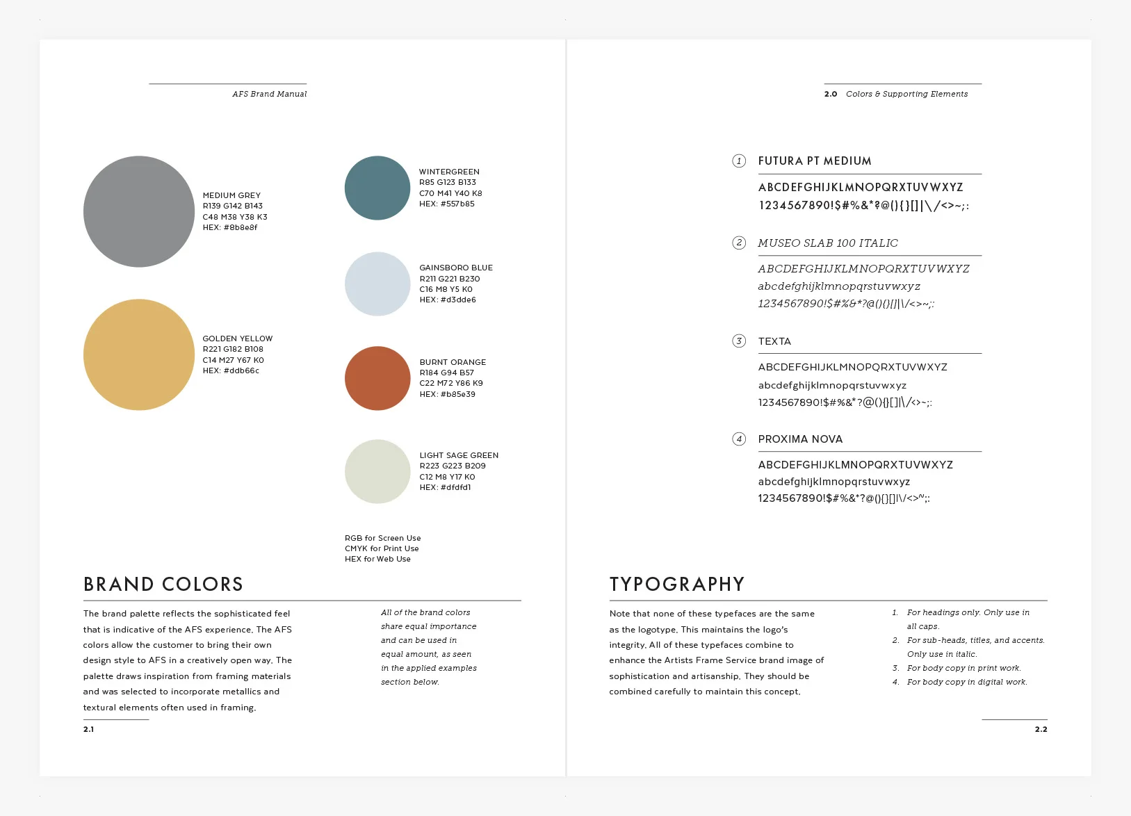
AFS was in need of a uniform and thoughtful brand system to make them relevant and clear to both returning and potential customers. Before, AFS didn't have defined brand standards other than the logo (which was similar to the one below except inverted and in a box) and a brand color of "yellow". But the use of yellow was inconsistent, and after discussing it with the executive board, the original reason why it had been chosen had been forgotten.
The yellow has historical value now, so it remains in the new brand palette. But it is refined, and it has been dulled and defined to a "golden yellow", which better represents the high quality materials that are used in custom framing. The secondary colors, as well as other branding elements such as typography, iconography and photography style, strike a balance of modern sophistication that can speak well to both new customers as well as clients that have been coming in for four decades.
02 –
The New
artistsframe.com
The creation of the new AFS website began with a professional site analysis from a contracted firm. From there, I created wireframes of each of the main pages as well as the top and bottom navigation. Once approved by the executive board, I organized and art directed a photo shoot and created the other assets for the site. Once all the components were ready, I laid out the site using Squarespace.
Before: The AFS site was very text heavy, which was unfavorable for an industry as creative and visual as framing. And the images the site did utilize were inconsistent in tone and weren't telling a compelling visual narrative for the company. The site was also hard to maneuver, with a navigation hierarchy that wasn't conducive to learning about the company and their services and a homepage that didn't make it clear to user that they could scroll down to see more information.
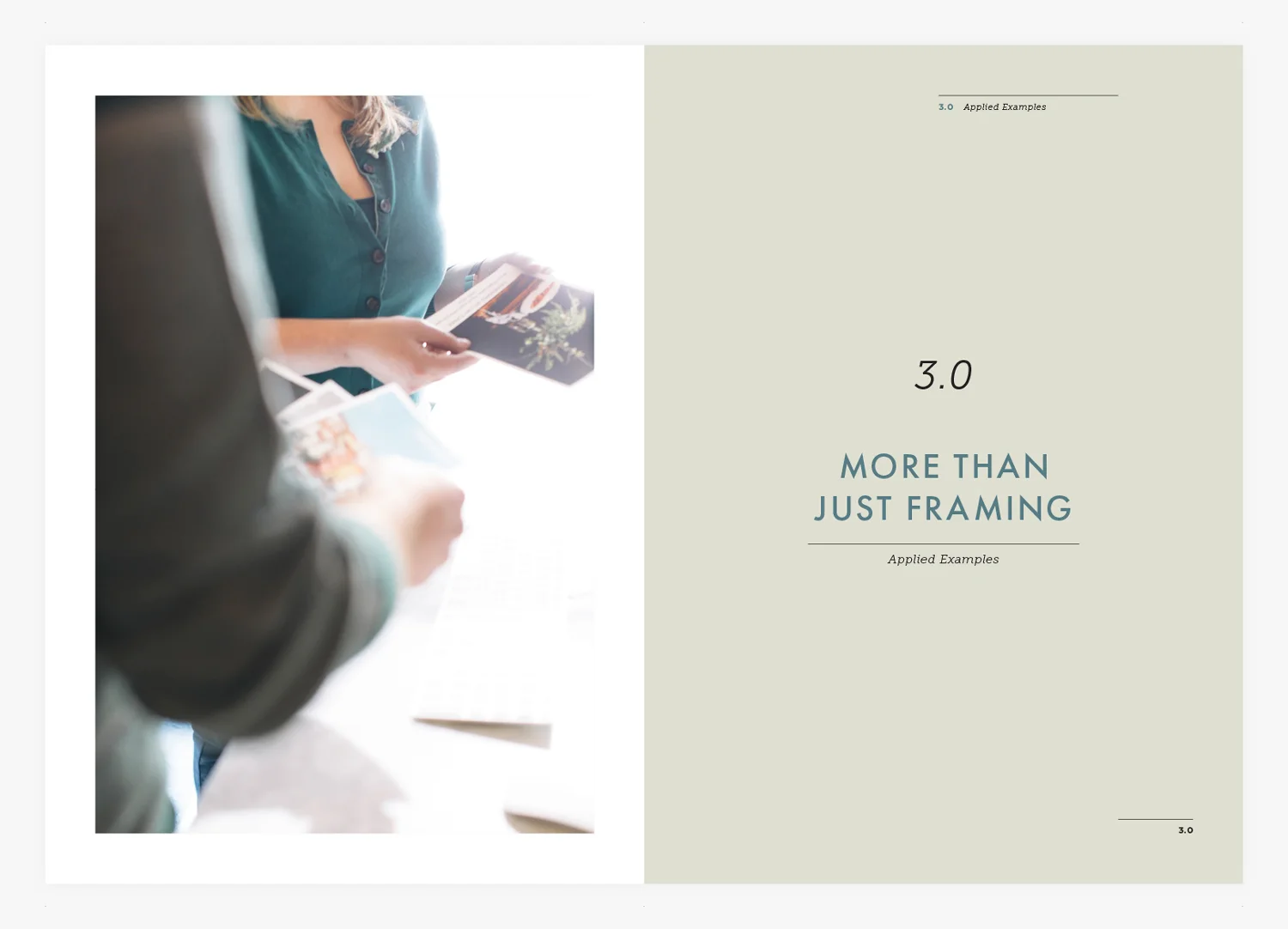
In the redesign, I focused on making the user experience simplified and visually engaging. A long scrolling homepage highlights the most popular services while also building credibility and answering the most commonly asked questions (or offering links for users that want to dive deeper). The heavy use of photography does the double duty of establishing the brand aesthetic and also "showing not telling" the user about the AFS products and experience.


